gganimate 예: 한국의 인구 구조 변화
http://www.ggplot2-exts.org/gallery/ 링크에 가보면 ggplot2의 확장 패키지들이 소개되어 있습니다. 이 중 첫 번째 패키지는 gganimate입니다. Hans Rosling 선생께서 우리의 눈과 귀를 즐겁게 해주었던 TED 강연도 이미 10여년 전이네요. gganimate은 차트로 움직이는 그림(애니메이션)을 만들기 위해 쓰입니다.
gganimate!
설치
install.packages('gganimate')
install.packages('gifski')
install.packages('png')
사용방법
기본적으로 ggplot2와 동일하다.
애니메이션은 사실 여러 그림을 연달아 보여주는 것에 지나지 않는다. 따라서 gganimate은 ggplot2의 Aesthetic mapping을 그대로 따르면서 시간에 따라 달라지는 변수를 정해준다.
+ transition_time(year)
그리고 여러 그림을 연달아 보여줄 때 그림 사이의 변화를 부드럽게 하기 위한 방법이 필요하다. (다른 방법은 ?enter_exit으로 확인 가능하다.)
+ enter_fade()
실례
자료
datPop <- data.table::fread('population.csv', encoding='UTF-8')
그림 한 장
먼저 2019년(올해)의 자료를 그려보자.
자료가 가로형이므로, ggplot을 사용하기 위해 세로형으로 변형한다.
library(dplyr); library(tidyr)
iyear = 2019
head(datPop)
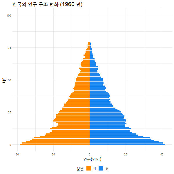
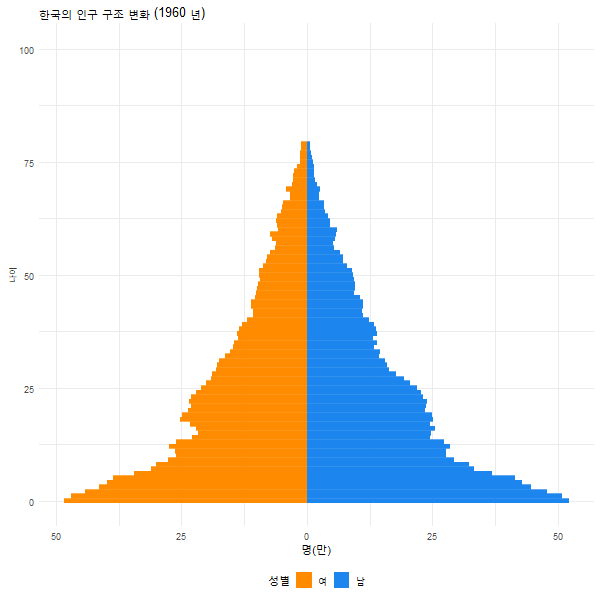
##     age  male female age2 year
## 1: 79세  6471  12315   79 1960
## 2: 78세  7281  11200   78 1960
## 3: 77세  9132  14453   77 1960
## 4: 76세 10586  13331   76 1960
## 5: 75세 11865  14565   75 1960
## 6: 74세 14077  19490   74 1960
datPopAni <- datPop %>% mutate(year=as.integer(year)) %>% gather(key='gender', value='population', male, female)
library(ggplot2)
ggplot(data=datPopAni %>% filter(year==iyear),
       aes(x=age2,
           y=ifelse(gender=='male',
                    population, -population), fill=gender)) +
  geom_bar(stat='identity', width=0.9,alpha=0.8) +
  #geom_freqpoly(stat='identity') +
  #geom_bar(data=datPop_ %>% filter(gender=='female'), stat='identity') +
  #geom_bar(data=datPop_ %>% filter(gender=='male'), aes(y=..count..*(-1))) +
  #scale_y_continuous(labels = paste0(as.character(c(seq(2, 0, -1), seq(1, 2, 1))), "m")) +
  scale_x_continuous(name='나이(세)') +
  scale_y_continuous(name='인구(만명)', labels=c(50, 25, 0, 25, 50), limits=c(-500000,500000)) +
  scale_fill_manual(name='성별', labels=c('여', '남'), values=c('darkorange', 'dodgerblue2'))+
  theme_minimal()+
  coord_flip() +
  #theme(legend.position='bottom', title=element_text(size=16)) +
  labs(title = paste0('한국의 인구 구조(',iyear,'년)'))

애니메이션
이제 애니메이션을 만들기 위해 두 가지를 결정해야 한다.
- 시간에 해당하는 변수를 정한다. 여기서는
year변수를 사용했다.(+transition_time(year)) - 화면 전환 방법을 정한다. 여기서는
+enter_fade()를 사용했다.
library(gganimate)
ggplot(datPopAni, aes(x=age2,
                   y=ifelse(gender=='male',
                            population/10000, -population/10000), fill=gender)) +
  geom_bar(stat='identity') +
  #geom_bar(data=datPop_ %>% filter(gender=='female'), stat='identity') +
  #geom_bar(data=datPop_ %>% filter(gender=='male'), aes(y=..count..*(-1))) +
  #scale_y_continuous(labels = paste0(as.character(c(seq(2, 0, -1), seq(1, 2, 1))), "m")) +
  geom_bar(stat='identity', width=0.9,alpha=0.8) +
  scale_x_continuous(name='나이') +
  scale_y_continuous(name='인구(만명)', labels=c(50, 25, 0, 25, 50)) +
  coord_flip() +
  labs(title = '한국의 인구 구조 변화 ({frame_time} 년)')+
  scale_fill_manual(name='성별', labels=c('여', '남'), values=c('darkorange', 'dodgerblue2'))+
  theme_minimal() +
  theme(legend.position='bottom', title=element_text(size=16)) +
  theme(legend.position='bottom') +
  transition_time(year) +
  enter_fade() -> p
이제 결과 p로 이미지 화일을 만들어보자.
animate(p, rendere=gifski_renderer(loop=TRUE),  width= 600, height=600)

##
## Rendering [>--------------------------------------] at 5.7 fps ~ eta: 17s
## ...
## Rendering [=======================================] at 5.1 fps ~ eta:  0s

##
## Frame 1 (1%)
## ...
## Frame 100 (100%)
## Finalizing encoding... done!
여기서 loop=TRUE는 애니메이션이 마지막 화면에서 정지한다. 만약 loop=FALSE로 바꾸면 애니메이션은 무한 루프를 돈다(애니메이션이 끝나면 다시 시작하기를 반복한다).
마지막으로 화일로 저장하고 싶다면,
anim_save('population.gif')
다음은 + enter_fade()를 사용한 것과 하지 않은 것의 차이를 보여준다.
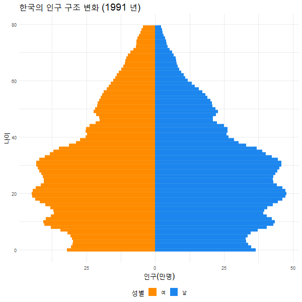
한국의 인구구조 변천사(1960-2020)


이렇게 보니 정말 애들이 없네요!
Leave a comment